Implementing Letterpress UI in UIKit
– 30 July 2013– 1538 words
Good artists copy. Great artists steal. — Steve Jobs, (mis)quoting Pablo Picasso.
Letterpress is a fantastic game. I remember how magical and fun the UI felt when I first played it. Letterpress was released when I was in the midst of completely rewriting the Exec Errands app, which involved a lot of custom UI components. I learned a lot about custom UI for iOS during that project, but Letterpress had some super advanced mojo happening in its UI. I wondered if I would ever be good enough to create something quite so magical as that. I was also shocked to learn that the entire UI of Letterpress is written using OpenGL instead of UIKit. I guess that's why they say, "You never go full Brichter."
For quite a long time I have wanted to write a 2-player turn-based game using Apple's Game Center infrastructure. Recently I was inspired by a board game that my family enjoys playing, and I decided it was just the right kind of game to turn into an app and experiment with turn-based game development.
I gave myself two challenges while developing the app:
- Create an abstractable turn-based game library that could be used to create subsequent game apps. All I would need to do in the future is write the game specific logic and interface, then the library would take care of the rest of the game-state and turn-based logic for free. Other boilerplate things like Themes and Sharing actions would also be handled by this library. This turned into a library of code called CCCGameKit.
- See how much of the Letterpress aesthetic I could achieve using my newfound custom UI chops, but I could only use UIKit, Core Graphics, and Quartz Core. This should also be a library that could be used in any app. Rewritten components like Alert Views and Action Sheets should have drop-in API and delegate protocols so that, as much as possible, standard UIKit components could just be replaced with these custom implementations without much code changing. This library of code eventually turned into CEKit.
CEKit turned out to be pretty compact:
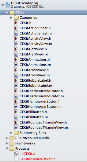
...while CCCGameKit was a bit more complex:
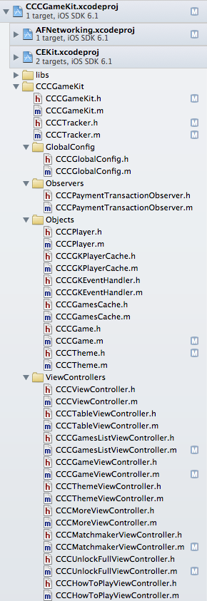
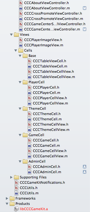
With the combination of CEKit and CCCGameKit, I produced an app that is pretty darn close to the look and feel of Letterpress. Thus, Tetra for iOS was born.
Below are some screenshots and gifs of parts of the game, especially demonstrating some of the similarities betwen the Letterpress and Tetra UI.
Disclaimer: gifs are displayed at 15 frames per second, but rest assured that the app runs at a full 60 fps rate on hardware all the way back to iPhone 3GS.
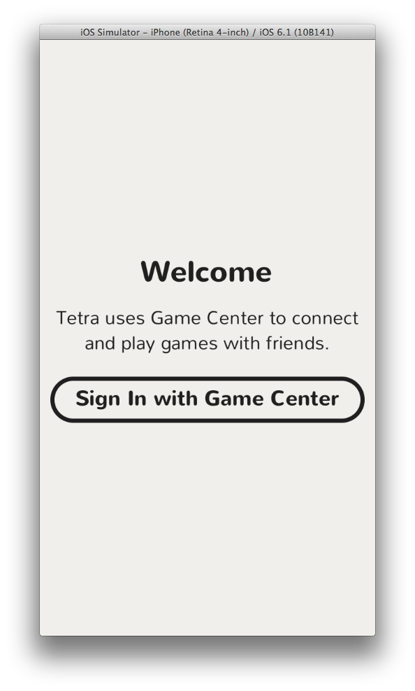
Launching the game:
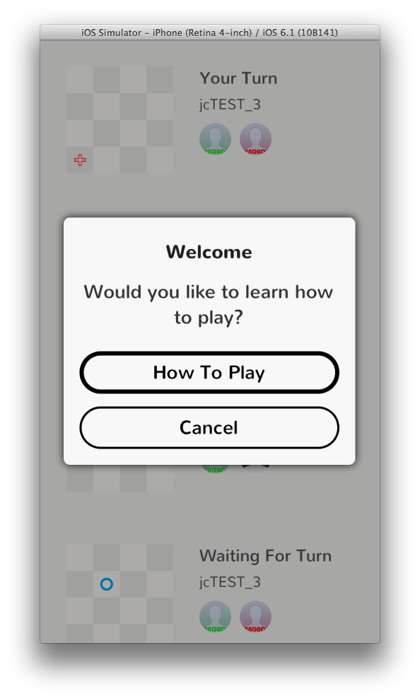
"How to Play" prompt on first launch:
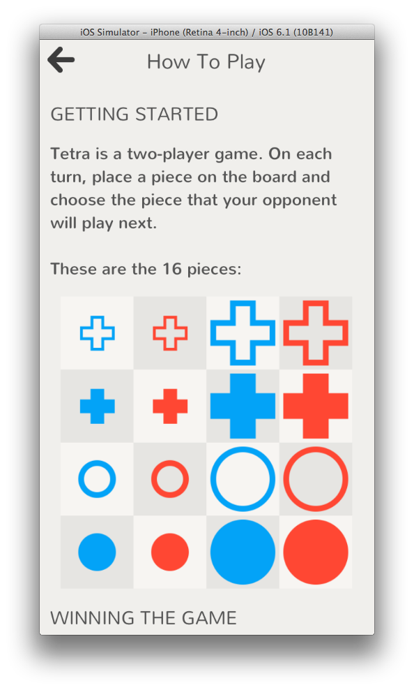
...which leads to the game instructions:
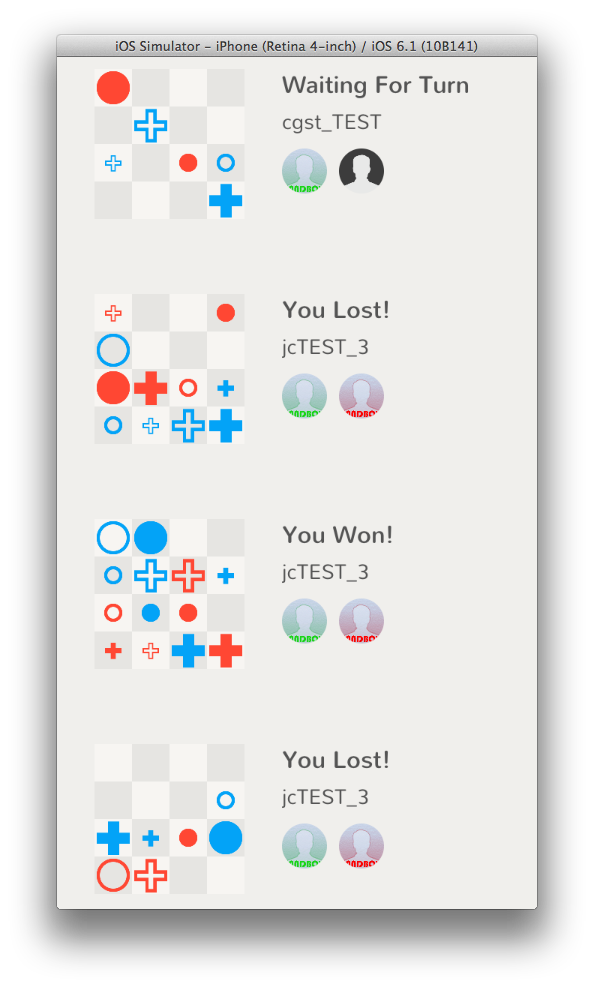
The list of current games and turn states:
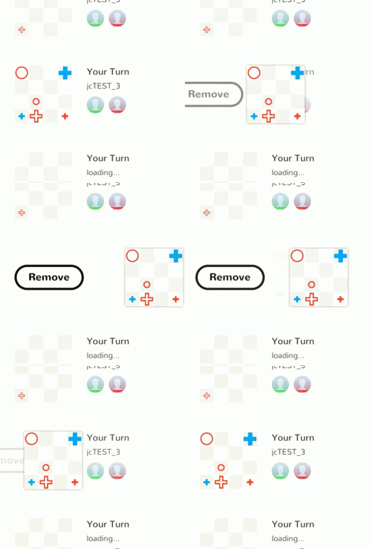
Swipe to remove a game (I am most proud of this interaction because it was the most difficult to get working correctly; sample of some of the code at the end of this post):
Game board view controller:
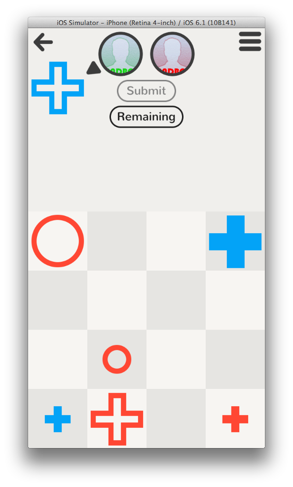
Menu action sheet spawned by the Hamburger Button in the top right of the screen (in Letterpress all menus are alert views, however I still like action sheets for many-choice menus):
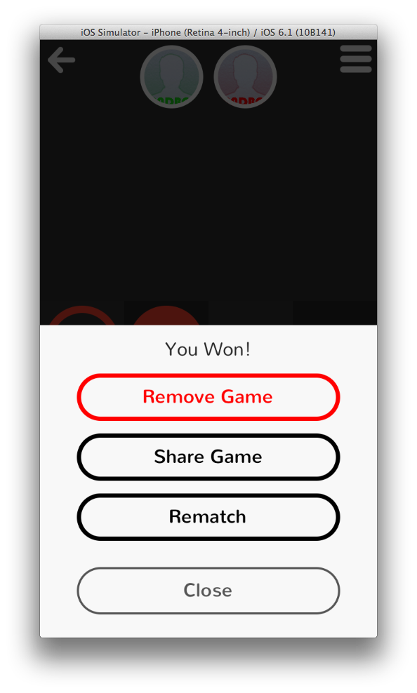
Alert View with flat pill buttons:
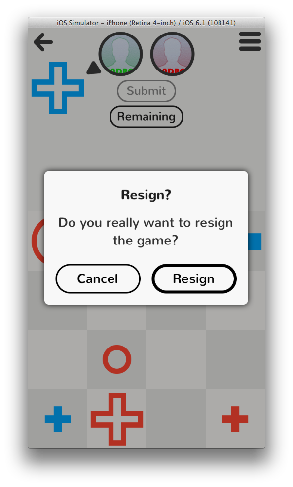
The alert view animates in from the top of the screen and falls off the bottom when dismissed. Each time it appears the amount and direction of rotation are random so each alert is unique:

Bubble labels pop open and closed to display ephemeral messages:
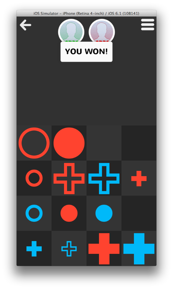
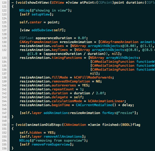
Animated bubble label (sample of code at the end of this post):

When the game ends in a tie (which is very rare), the board does something a bit whimsical, just for fun:
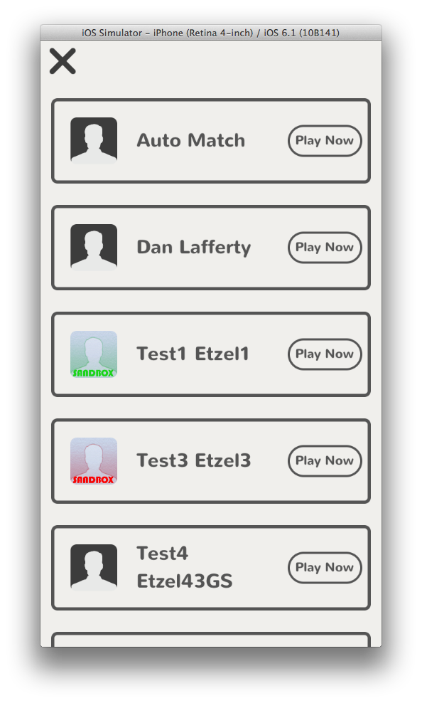
One new view controller I created for the app was a custom Matchmaker View Controller for starting a new game. The standard Apple Game Center matchmaking interface is quite cumbersome and can take up to 5 taps to start a game with a friend. I decided it could be done in 1 tap:
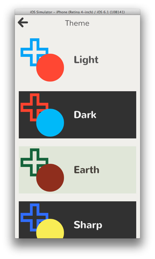
There is also a theme system in the app which will re-skin all the components with different colors:
The second hardest thing to accomplish while trying to achieve Letterpress-level UI exactness was implementing the navigation bar which adds a slight shadow when the content below is scrolled up underneath the navigation bar:

Somewhat more difficult is also animating the navigation bar color to a lighter shade when a dark theme is in use (sneak peak of code at the end of this post):

Graphics
With the exception of the pre-loaded screenshots for the "How To Play" view controller, there are only four graphic assets in the app. All of the other visual elements (including all of the game pieces, disclosure indicators, hamburger buttons, etc) are drawn programmatically using Core Graphics and Quartz Core and cached as UIImages. The only graphics that are fetched remotely are the player avatars from Game Center.
Results
Overall I am really happy with how things turned out. This has been the most challenging software product I have built as a side-project. I started the app on May 14, 2013 and have been working on it during random hours on nights and weekends. In total it has been about 100 hours of work. Making this app has been extremely satisfying because it forced me to learn many new things about UI code and forced me to think about how to abstract and generalize functionality from the beginning so that the code may be reused in future apps.
This has certainly been the culmination of my 3 years of professional Objective-C programming. I don't think I went Full Brichter, but maybe I was able to go Half Brichter.
Some stats according to cloc:
- 4707 lines of code in CCCGameKit
- 2158 lines of code in CEKit
- 4498 lines of code in Tetra-specific files
Frame rates:
- 60 fps on iPhone 5
- 60 fps on iPhone 3gs
- 60 fps on iPod Touch 5th gen
- 50+ fps on iPad Mini
- 50+ fps on iPhone 4
I'm sure if I worked a bit more on image caching and compositing I could get the iPhone 4 and iPad Mini up to 60 fps. Perhaps in v2.
Things I didn't implement for v1
There were a few things I purposefully did not implement for v1 because of time constraints (or more likely, they are just out of my grasp to implement in UIKit, for now...)
- Drag panning alert views - In Letterpress, you can drag alert views up and down the screen with your finger. You can dismiss alert views by pressing a button or by flinging them off the screen by pulling them down quickly. This feature didn't seem strictly necessary to me, however now that I have a handle on UIPanGestureRecognizers from getting the "Swipe to Remove" interaction right, I think I know how to implement this in v2.
- Swipeable view controller navigation - Much like Windows Phone's Metro UI framework, Letterpress allows you to move between screens in the navigation stack by swiping across the screen to move between them. For now I am just using a stock UINavigationController to handle view navigation (and doing my own navigation bar magic within the stack). Swipe navigation was not something I wanted to tackle in v1. I suppose this could be accomplished using a custom Container View Controller, but this seemed beyond the scope of the app for now. Maybe this was something that was easier to implement in OpenGL.
- Game-preview-to-game-board-zoom - When you tap on a game in the main game list in Letterpress, the game preview (represented by colored squares) magically zooms from the preview frame to the full screen while also fading the letters and rest of the game chrome into view. I also render a preview of the current game-state, however for now I just do a simple push to the game board. I plan to make this transition more magical in v2.
Sneak Peek of the Code
For the curious, here are a few glimpses into the codebase.
The logic that handles adding/removing the shadow (and changing the color) of the navigation bar when content scrolls beneath it:
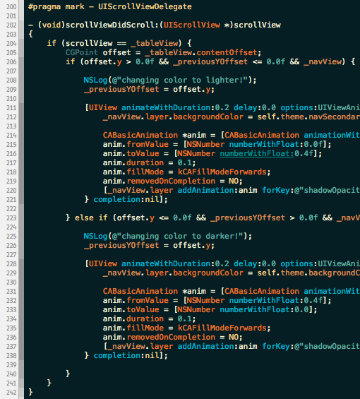
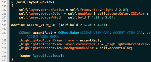
After setting all of the properties, the creation of the pill buttons UI happens almost exclusively in the layoutSubviews method:
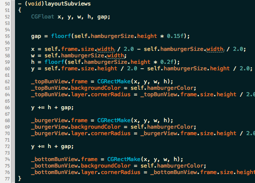
Similarly, the hamburger menu button is rendered in code during layoutSubviews:
Everytime I see a bubble label appear it makes me smile because it reminds me of Pop-Up Video. Here is some of the animation code responsible for displaying a bubble label:
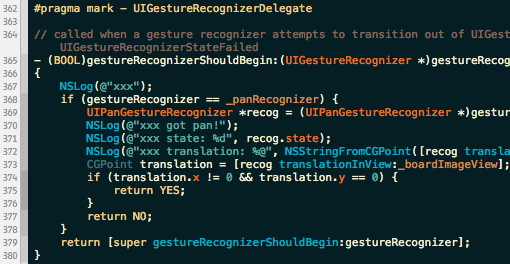
In order to correctly implement the Swipe to Remove in the game list cells, I had to implement part of the UIGestureRecognizerDelegate protocol. I learned that UITableViewCells also implement this protocol, so I had to be careful to call super in the case my recognizer was not the one being triggered by scroll or swipe gestures:
Coming Soon
Tetra should be available on the App Store by the end of August. I just need to clean up a few bits of UI here and there, and then I can ship it.
Thanks to Loren Brichter, Karen Cheng, Eric Florenzano, Jason Kozemczak, Dan Loewenherz, Chris Mitra, Paul Stamatiou, and Cristian Strat for proofreading this post.
Further discussion on Hacker News.
— Fin.